Top 5 Restaurant Websites Of December 2021
Restaurant Websites are some of the most important marketing tools. And while great food keeps customers coming back, an excellent restaurant website could do some of that heavy lifting too. Not only do great websites keep customers, but they could also bring in new business. We’ve collected five of the best restaurant websites of December 2021 to share some of their special features.
Let’s check out Restaurant Monsters’ top five restaurant websites of December 2021.
These Restaurant Websites are great examples of how to convert web visitors into paying customers

1
Ozzie’s Good Eats serves lunch and dinner, but not breakfast. When navigating to their website, you immediately get a look into their dining room which is full of mahogany wood, tiles floors, and black leather. Squaring off the central picture is a red frame. Across the top, you’ll see the phone number, address, and other primary contact information. In the bottom red frame, you’ll see links to their Facebook, Instagram, Yelp, and Trip Advisor pages.
The menu across the top of the page provides access to reservations, menus, online ordering, feedback, job postings, community kitchen involvement, and a gift card center. Their reservations platform is Resy, and it is accessible on the mobile website too. The menu selection will bring up a choice between lunch and dinner. There’s also a small option at the bottom to display the gluten-sensitive menus. When you click on the “order online” option, you’ll see that it is not currently active for this restaurant, but they have the platform set up to do it. They utilize ChowNow to make this happen. Next in the menu, you’ll see an option for feedback. Clicking this, you’ll be taken to a pop-up where you put in your information (name, email address, and phone number) and then any questions or concerns you have for the restaurant.
Since Ozzie’s runs through Great American Restaurants, their jobs and careers page is a communal area for all restaurants under that name. The website hires any position you could hold in a restaurant from bartender to maintenance. When you click on each position’s name, it takes you to a job description with duties, the benefits package, and an opportunity to apply or even share the position.
When clicking on the community kitchen option, you’ll be taken to a page that shares the company’s involvement in The Great American Community Kitchen, which prepares and shares meals with people experiencing food insecurity. On this page, you have an opportunity to contribute financially to the cause. The last option across the top of the main page is for gift cards. Here, you can check your gift card balance or purchase a gift card.
The website runs smoothly on a mobile device as well as a computer. It has an easy-to-use navigation system that is not overwhelming to use. Patrons can easily create a reservation or even purchase a gift card. Ozzie’s community engagement option also make it clear that the restaurant is interested in providing for and helping their community. And when the online order features are active, customers will be able to easily order carry out.
Overall, this is an excellent restaurant website. That said, though the restaurant does share an image of the dining area, we’d like to see more pictures of their food offerings on the menu. Video content would also make this website pop because it could give potential customers an even clearer view of what they can expect from Ozzie’s Good Eats.
Top Tips For Your Restaurant Websites
- Give your customers a glimpse into what the experience is like at your restaurant
- Make your menu clear and easy to understand
2
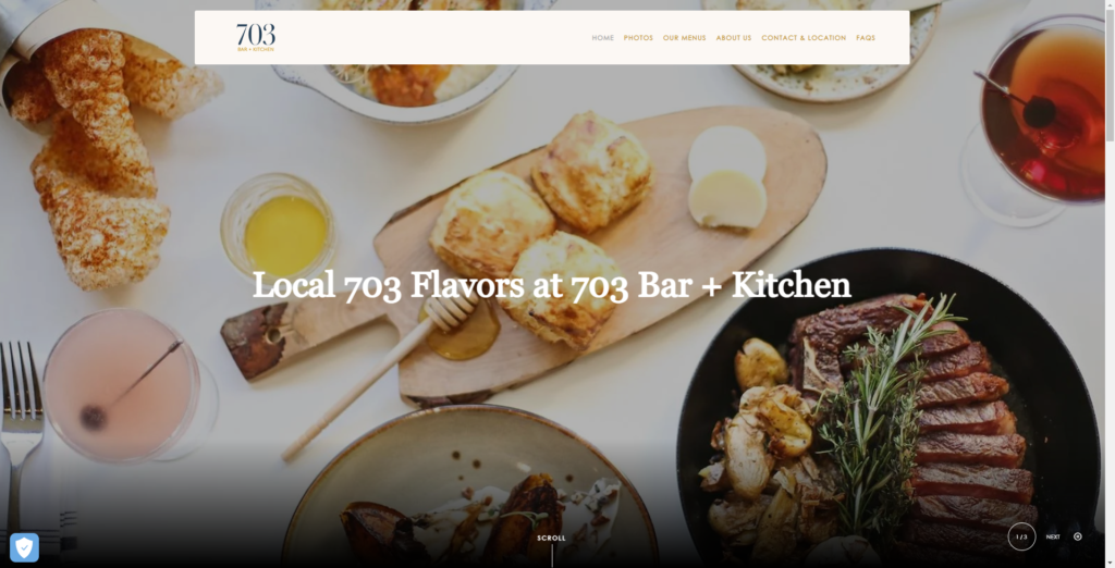
703 Bar and Kitchen serves breakfast, lunch, dinner, drinks, and even has a happy hour. Upon navigating to the webpage, you’ll see scrolling images of different offerings. These images take up most of the page, but the menu bar at the top has options for home, photos, menus, about us, contact with location, and an faq section. Under the photo section, you’ll find options for dining and menus, a review portion, an image of the dining area, and an invitation to host an event there. Finally, in a golden yellow portion on the bottom, you’ll see contact information, hours, and links to their Instagram and Facebook pages.
In the photos section, you’ll see several images of prepared meals and areas of the restaurant. By clicking on the menu option, you’ll see the various types of menus and the offerings available throughout the day. The about navigation takes you to a burb about what the restaurant serves and how they reflect the Fairfax area. As expected, the contact and location section contains information about where you would find the restaurant and how to get ahold of the restaurant should you need to. There’s also an area at the bottom of this page for getting directions to the restaurant. The FAQ section provides answers to many questions customers may have before making the reservation and heading to the restaurant. For example, the cleanliness procedures and parking situation is all laid out in these answers.
This website provides absolutely stunning photos of the restaurant and some of the food prepared there. Especially on the landing page, they help set the mood and tone of the restaurant in a really inviting and enjoyable way. However, we would like to see them include more photos in the website’s menu section to dress up this area a little more. We also enjoyed seeing the FAQ section because this can help alleviate some of the questions that restaurants often get asked. Also, though we enjoyed the color palette of this website, the font can become difficult to read white it is against the golden background.
Top Tips For Your Restaurant Websites
- Use great images of your food and drinks to entice customers to experience them for themselves
- Leverage a FAQ section to answer questions customers might have.

3
Upon navigating to the Ocean Paradise Restaurant and Bar website, you’ll immediately see the photo displaying a lobster tail meal. Across the image, there’s a banner that advertises fresh seafood, which creates a true ocean paradise. Below the header, you’ll see a drop-down menu with the options of menu, order online, gallery, gift cards, and contact. Below the main image at the top of the page, you’ll see a description and mission of the restaurant. Below that, you’ll see several pictures of their seafood offerings with a statement sharing that they have more options than only seafood. After that, you’ll see squares with other navigation options to delivery, takeout, and the full menu, followed by a list of the chef’s favorites. The very bottom of the page provides maps assistance contact information and links to Facebook and Instagram.
When selecting the menu portion of the navigation, you’ll be taken to an active page giving menu options, prices, and descriptions of various selections. The menu includes appetizers, signature dishes, fried entrees, pasta, land choices, sandwiches, soups and salads, tacos, burgers, desserts, side dishes, beverages, wines, cocktails, and beer. There’s also a kid portion of the menu specifically for children 10 and under. The online order option takes you to a platform for ordering ahead for pickup or delivery. You could even schedule ahead if you wanted. The gallery offers several photos of various entrees the restaurant prepares to get a good feel for the types of foods served. The website also has a dedicated place for ordering gift cards online. These gift cards are delivered over email, immediately available to the recipient.
The layout and color scheme of this website is excellent, and the motion of the graphics and responsiveness of the menus all create a very enjoyable viewing experience. In addition, the website makes it easy to check the menu, order online, and even order gift cards. These options allow the customer to get a good feel for the restaurant before even setting foot inside. That said, even though this website is already a great one, the icing on the (crab) cake would surely be the addition of video content.
Top Tips For Your Restaurant Websites
• Make it easy to navigate your restaurant website.
• Use a clean layout and color scheme that fits your brand.

4
PokeHub
PokeHub‘s website offers visitors a great deal of information. Beginning with an image on the main page, it shares what poke is for customers who may not know. By clicking on the PokeHub menu button, you’ll see the options for the main site, information about the restaurant, menu, franchising, and locations. At the bottom of the page, you’ll see a definition for poke as well as links to their Facebook and Instagram accounts.
The about us section shares what PokeHub is all about when it comes to raw fish. They assure the customer that their fish is delivered and prepared the same day and sauces are prepared in-house. The menu selection takes customers to the various steps of building a poke bowl: base, mix-ins, toppings, proteins, and sauces. Here, they also share their house made signature bowls with predetermined ingredients. The franchise option takes interested parties through a couple of reasons why PokeHub is a good investment opportunity. Finally, the locations part shares information specific to your desired location, including a map, contact information, parking details, and a place to message the restaurant should you need to.
This website features absolutely gorgeous photos of their selections. Poke is inherently photogenic, so it comes as no surprise that the photos are quite beautiful. They also make the ordering process very easy. That said, this website could benefit from some video content, perhaps of poke being prepared by their chefs. Also, a beautiful gallery of photos would add even more visual intrigue.
Top Tips For Your Restaurant Websites
- If you showcase an unusual food use photos and descriptions to help potential customers understand what you have to offer
- If your food is inherently photogenic and colorful leverage that as much as possible and reflect it in your design

5
Hangry Joe's
Hangry Joe‘s is a chicken company that specializes in the Nashville Hot Chicken Sandwich. Upon pulling up the website, you’ll immediately notice a photo that features this sandwich and an option to order online. Below that, you’ll see an opportunity to learn more about the company, an email input to sign up for their newsletter, and even reviews from fellow customers. Finally, you’ll see selections for about us, job opportunities, menu choices, online orders, and even franchise information at the top of the page.
The about us page shares the story of Hangry Joe’s and images of their food. For career opportunities, you’ll see a video for making hot chicken and an opportunity to apply for a job. The menu takes you to their listing of options, including the chicken fingers, chicken waffles, and nuggets. You can also select the spice level of your chicken. The online order section takes you to a place to make an order, and the franchise information section takes you to a place to input information to receive franchising opportunities.
This website creates a very appetizing experience for the visitor, thanks to all of the food images. However, with the multiple “coming soon” statements, the website appears only partially finished. It could also benefit from even more video content and more photos. Additionally, the graphic designer should probably take another look at the text to be sure it is always easy to read and understand.
Top Tips For Your Restaurant Websites
- Make it easy for customers to give you their contact information
- Tell the story that only you can tell
Be Inspired To Improve Your Restaurant Websites
These sites are excellent examples of how web design can attract diners to your restaurant. Think about what was most effective on these pages, such as engaging staff photos, unique origin stories, or clear layouts. Identify your favorite tips and tricks, then try applying these ideas to your restaurant’s websites.